Have you ever wondered why some brands make you feel warm and cozy while others ignite your excitement? It’s not just luck; it’s the science of color psychology! Colors have the magical ability to tap into our emotions and influence our behavior. From the cheerful yellow of McDonald’s to the calming blue of Facebook, brands use colors to create an emotional bond with you.
Red for Energy, Blue for Trust: Decoding Color Emotions
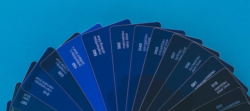
Imagine a world without colors – it’d be like watching a movie in grayscale. Colors speak to our feelings, and each hue has its superpower. Red, that fiery hue, exudes energy and urgency, making it perfect for clearance sales and grabbing attention. On the other hand, the serene blue whispers trust and reliability, a reason why many financial institutions flaunt it.
Choosing Your Brand’s Color Palette: A Creative Adventure
Selecting the right colors for your brand is like picking the right ingredients for a recipe. Are you whipping up a youthful vibe? Reach for vibrant greens and playful oranges. Seeking elegance? The sophisticated black and gold combo might be your flavor. Your color palette is the secret recipe to communicate your brand’s personality to the world.
When you dress your brand in colors that resonate with your audience, magic happens. If you’re an eco-conscious business, earthy greens and blues say, “We care about our planet!” If you’re all about innovation, a splash of purple tells customers, “We’re the creative wizards in town.” Your color choices shout your brand’s values even before you utter a word.
The ‘Feel Good’ Factor: Connecting with Your Audience
Colors are like the silent storytellers of your brand. Warm colors like reds, oranges, and yellows ignite enthusiasm and evoke feelings of warmth and positivity. If you want customers to feel excited about your product launch, sprinkle some red into your marketing materials. Cool colors like blues and greens, on the other hand, create a sense of calm and trust. Blue is the color psychology that responds to healthcare brands or those aiming to establish a reliable reputation.
It’s not just about primary colors; shades and tints play a vital role too. Lighter tones evoke feelings of innocence and simplicity, while darker shades radiate sophistication and elegance. Mixing and matching colors can create harmony or contrast, depending on the emotional journey you want your customers to embark on.
In this colorful world of brand identity and as the basis of color psychology, remember that consistency is key. When you’re designing your logo, website, and marketing materials, stick to your chosen palette. A consistent color scheme builds brand recognition faster than you can say “rainbow.”
Color Palette Magic: Unveiling the Art of Audience Connection

Congratulations, future startup superstar! You’ve got your brilliant idea, a sprinkle of ambition, and a dash of caffeine-induced energy – you’re ready to launch your startup. But wait, what about your brand’s color palette? Buckle up, because we’re diving into the world of color psychology that’ll make your startup shine like a supernova.
Cracking the Color Code: Speak Your Audience’s Language
Think about it – colors are like languages that your target audience understands without needing a translation app. But here’s the plot twist: each color speaks a different dialect. That perky yellow? It says, “Hey, we’re youthful and fun!” Calming blues murmur, “Relax, we’ve got this covered.” Red shouts, “Let’s get things done!” Choosing the right palette is like composing a symphony of emotions that resonate with your audience.
The Color Quest: Matching Hues to Your Audience
Start by putting on your detective hat and investigating your audience. Who are they? What’s their vibe? If you’re aiming for the young and adventurous, maybe vibrant oranges and energetic reds are your jam. If you’re catering to a health-conscious crowd, greens and earthy tones could be your color soulmates.
Here’s the secret sauce: contrast. Colors like opposites, just like peanut butter and jelly. Pairing light with dark or bold with muted creates visual harmony that keeps your audience’s eyes glued to your brand.
Say No to Color Clashes: Building a Harmonious Palette
Okay, so you’ve got a wild palette of colors in front of you, and they’re all vying for attention. What now? Remember, less is more. Too many colors create chaos, like a dance floor without a DJ.
Start with a dominant color – the one that’ll be your brand’s signature hue. Then, add supporting colors that complement and elevate the star of the show. And for a dash of contrast, throw in an accent color that pops.
The Rainbow Effect: How Colors Give Brands a Makeover
You know that feeling when you change your hair color and suddenly, you’re strutting around like a whole new person? Well, brands do that too, but with colors. Imagine the world of logos and brand identities as your favorite reality makeover show, and the contestants? The colors!
From Bland to Brand: The Colorful Evolution of McDonald’s
Remember when McDonald’s was all about that muted red and boring yellow? Well, someone handed them the magic wand of color psychology, and BAM! They transformed into a vibrant red and lively yellow combo that practically screams, “Bite into happiness!” That’s the power of colors.
The Apple Effect: How Going Minimalistic Made a Maximum Impact
Let’s talk tech. Remember the old Apple logo? It was like a scene from a sci-fi movie – way too complicated. But hey, Apple decided to embrace the minimalist trend and swapped that intricate logo for a sleek, monochromatic apple with a bite taken out of it. Simplicity turned them into tech gods.
Click here to read the story behind the evolution of the Apple logo and the color psychology behind it.
Netflix: Redefining Red for the Streaming Era
Netflix knew they had to nail that “Stay, relax, and binge-watch” vibe. So, they embraced the sultry red – the color of energy and entertainment. It’s like they painted their logo with “movie marathon” in mind.
Pepsi vs. Coca-Cola: The Color War of the Century
You can’t escape the Pepsi vs. Coca-Cola feud, and guess what? Their color battle is real. Pepsi rocks the vibrant blue, invoking feelings of freshness and youthfulness. Coca-Cola, on the other hand, flaunts a classic red that whispers, “Hey, I’m that old friend you can always count on.”
Color Magic: Beyond the Surface
Colors possess a mesmerizing ability to go beyond appearances, tapping into the very essence of our emotions. The intricate psychology of colors delves deep into our subconscious, triggering memories, feelings, and cultural references. Just think about the fiery red that ignites passion or the calming blue that mirrors the serene sea – these colors hold a profound influence on how we perceive the world around us.
Creating a Color Symphony: The Power of Harmonious Palettes
Building a color palette for your brand is akin to composing a symphony of hues. Each color plays a distinct role, and the harmony they create is like music to the eyes. Picking colors isn’t a random affair; it’s a carefully orchestrated process where shades complement each other. When your brand’s colors work together seamlessly, it’s like listening to a symphony where every note flows in perfect rhythm.
Color Your Story: Branding Beyond Words
Colors have an incredible knack for storytelling without uttering a single word. They’re like characters in your brand’s narrative, painting a vivid picture of its personality and values. Bold reds exude energy and courage, while serene greens evoke nature and growth. Color psychology transcends language barriers, speaking directly to the emotions of your audience and etching your brand’s identity into their minds.
Cultural Color Connections: The Global Language of Hues
The language of colors knows no boundaries; it communicates across cultures and continents. However, the meaning of colors isn’t universal – it shifts with geography and tradition. A color that symbolizes purity in one culture might signify mourning in another. When building a brand for a global audience, understanding these cultural nuances becomes vital to ensure your message isn’t lost in translation.
Empower Your Brand with Colors: A Palette of Possibilities

Colors are more than mere aesthetics; they’re tools for empowerment. By comprehending color psychology and weaving it into your brand strategy, you’re equipping your brand with a powerful means of communication. Every shade becomes a brushstroke on the canvas of your brand’s identity, painting emotions, experiences, and values that resonate with your audience on a profound level.
Colorful Strategies: Painting Success with Brand Identity
In the realm of branding, colors aren’t just decoration; they’re strategies. The right color palette can influence consumer behavior, convey professionalism, and even dictate purchase decisions. By mastering the art of color psychology, you’re not just selecting colors – you’re strategizing to create an emotional connection that turns casual consumers into devoted brand advocates.
Colors in Action: A Journey Through Brandscape
Embark on a journey through the brandscape and witness how colors work their magic. Dive into iconic brand identities and observe how color choices transform their narratives. Discover how Starbucks’ rich green evokes a warm café ambiance, or how Coca-Cola’s classic red sparks memories of happiness. Colors aren’t just pigments; they’re the heartbeats of brands, shaping experiences and capturing hearts.
Colors are like the threads that weave the fabric of your brand’s story. Their significance extends far beyond aesthetics, influencing emotions, behaviors, and perceptions. By mastering the art of color psychology, you’re unlocking a world of possibilities to communicate your brand’s essence. So, dip your brush into the palette of emotions, and let your brand’s colors tell a captivating tale.
Click here if you need help in choosing the perfect color palette for your brand.

